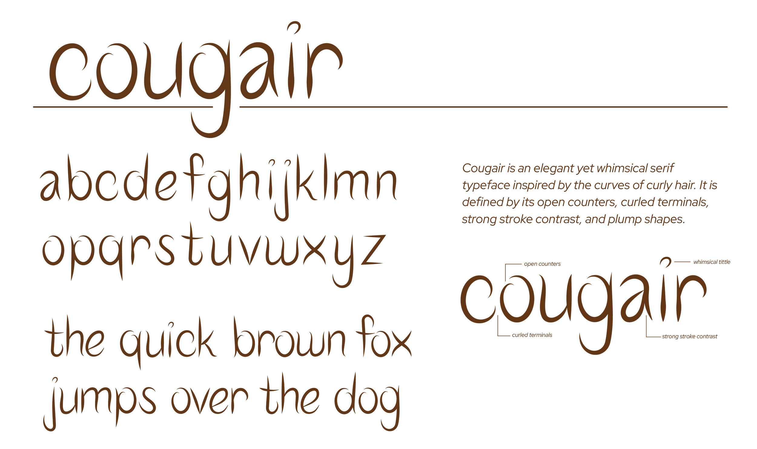
COUGAIR
TYPEFACE DESIGN
The creation of Cougair started with the inspiration drawn from the shapes and movement of curling plant tendrils. These natural forms informed the typeface’s distinctive features: its curled and tapered terminals, plump shapes, and open counters. The process began with sketches to explore how these organic elements could be translated into letterforms. Through iterative refinements, the design balanced the softness of natural curves with a bold structure, ensuring both readability and a unique visual identity.
This typeface works especially well in branding applications where personality and distinctiveness are important. On wine bottle labels, Cougair conveys elegance and craftsmanship, enhancing the product's artisanal appeal. Its curling, organic forms align naturally with the imagery of vineyards and the care that goes into winemaking. For curly hair salon signs, Cougair reflects movement and individuality, resonating with the playful and celebratory tone of the brand. Its expressive shapes can even add a fresh, contemporary edge to toothpaste packaging, combining cleanliness with a nod to nature.
Cougair is defined by its open counters and strong stroke contrast, creating a dynamic yet approachable aesthetic. The curled terminals and generous curves add character and personality without sacrificing clarity. It is versatile and impactful, with the ability to stand out in display settings while maintaining cohesion in branding and design projects.
Throughout its applications, Cougair offers a bold and memorable design solution, bringing a sense of movement and life to a wide range of projects. Its unique blend of organic inspiration and precise design makes it a versatile and engaging typeface for branding, packaging, and beyond.


